Interior Design Color Theory: Master Timeless Palettes


A homeowner stands in a half-finished room with paint chips in one hand and a wood finish sample in the other. The walls are still undecided. The dining table will be seen every day for years. The sectional may be custom ordered and built to last. Suddenly, color doesn't feel playful. It feels permanent.
That pressure is understandable. Color decisions touch everything, from how a room feels in morning light to whether a solid cherry table looks rich and grounded or oddly disconnected from the flooring. A soft leather can look refined beside one wall color and flat beside another. Most of the stress comes from trying to make isolated choices instead of seeing the room as a whole system.
Interior design color theory gives that system a language. It turns “something feels off” into clear questions about warmth, contrast, proportion, and light. For homeowners making long-term decisions about heirloom pieces, that shift matters. A room built around solid maple, walnut, oak, or cherry deserves more than guesswork.
From Overwhelmed to Inspired A New Approach to Color
A couple buys a new home in Columbus. The floors are already in place. The living room needs a sectional. The dining room calls for a table with real visual presence. They begin, as many do, with paint. Within a week, they're stuck. The beige feels safe but dull. The greige looks polished in one store and cold at home. A leather sample that looked buttery and warm under showroom lighting suddenly reads darker at night.
That spiral happens because color is often treated as decoration instead of structure. In reality, color shapes how every permanent material relates to every other one. It affects whether solid walnut feels deep and refined or heavy. It affects whether a premium leather recliner feels integrated with the room or dropped into it.
A calmer approach starts by treating color as a tool. Not a test of instinct. Not a gamble. A tool.
Good color decisions don't begin with chasing a trend. They begin with identifying what the room needs to feel like and what materials need to live together gracefully.
That mindset helps homeowners stop asking, “What paint should go on the wall?” and start asking better questions:
- What is the anchor material that won't change for years, such as flooring, cabinetry, or a solid wood dining set?
- What mood should the room support when the sun changes and lamps turn on?
- Which finishes need to relate rather than match exactly?
For readers who want another practical perspective on narrowing choices before the first paint can opens, this Melbourne home colour advice offers a useful outside reference on approaching selections with more confidence.
Once color is understood as a framework instead of a risk, the room starts to feel less like a minefield and more like a composition.
Foundations of Color The Wheel and Its Harmonies
The color wheel looks academic until it's connected to real materials. Then it becomes practical very quickly. A homeowner choosing between a warm cherry dining set and a cooler gray performance fabric is already using color theory, whether it's named that way or not.
Understanding the wheel without overcomplicating it
At its most basic, the wheel organizes color families and shows how they relate. Designers use it less as a piece of classroom theory and more as a map.
A few core terms make it easier to read:
- Primary colors are the base hues.
- Secondary colors are created from those base hues.
- Tertiary colors sit between them and create more nuanced blends.
That matters because most interiors don't use pure color. They use softened versions. Dusty blue. Smoky green. Clay red. Mushroom taupe. The wheel helps explain why some pairings feel settled while others feel unsettled.
Warm and cool colors in a furnished room
Temperature is where many readers get tripped up. Warm colors usually carry yellow, red, or golden influence. Cool colors tend to carry blue, green, or gray influence. In a room, warm tones tend to feel closer and more enveloping. Cool tones tend to feel calmer and more expansive.
That becomes highly tangible with furniture:
| Material or finish | Likely read | Common effect in a room |
|---|---|---|
| Solid cherry | Warm | Rich, inviting, traditional or tailored |
| Oak with golden cast | Warm | Comfortable, sunlit, familiar |
| Gray fabric with blue cast | Cool | Crisp, quiet, airy |
| Walnut with cooler stain direction | Cool-leaning neutral | Sophisticated, grounded, modern |
The relationship between those materials matters. As noted by Room Enhance, the psychological weight of color is shaped by undertone compatibility and lighting physics. Mixing warm undertones with cool undertones in major elements can create immediate visual discord, while matching undertones supports cohesion, as described in this room color theory discussion.
Harmonies that work in real homes
Most successful rooms rely on a small number of harmony patterns.
- Analogous schemes use neighboring colors. Think sage, olive, and moss. They feel easy and continuous.
- Complementary schemes use opposites. Think muted blue with warm terracotta. They bring energy and contrast.
- Monochromatic schemes stay in one family but vary value and texture. That's where leather, wood grain, and woven textiles carry a lot of the interest.
Design shortcut: If a room already contains expressive wood grain, a quieter color harmony often lets the craftsmanship do the talking.
Bedrooms often benefit from this restraint, especially when the goal is rest rather than stimulation. Readers exploring mood-led choices may find this expert guide on bedroom color psychology helpful alongside this broader discussion.
For a furniture-first way of thinking about these relationships, this expert palette guide offers a helpful companion read.
The 60-30-10 Rule for Perfect Proportions
Some rooms fail even when every individual choice seems attractive. The wall color is fine. The sofa is beautiful. The rug works on its own. Yet the space still feels busy, flat, or strangely unresolved. Usually, the issue isn't color selection alone. It's distribution.
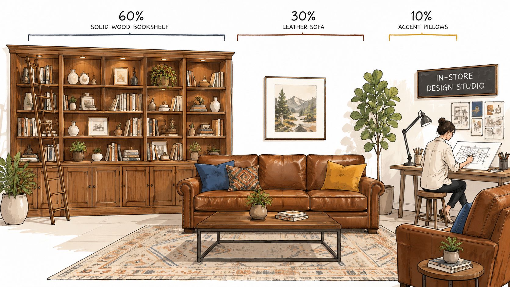
The clearest framework for avoiding that problem is the 60-30-10 rule. According to RMCAD's overview of color theory in interior design, a dominant color should occupy about 60% of the room, a secondary color should cover 30%, and an accent color should fill the remaining 10%. That proportion helps prevent a room from becoming either a “flat, textureless monochrome room” or a “visually chaotic mismatched scheme.”

What the percentages look like in real life
The numbers sound rigid, but they're best understood as visual weight.
- The 60% usually lives on walls, large rugs, and broad background surfaces.
- The 30% often comes from upholstered seating, drapery, or a substantial wood furniture grouping.
- The 10% is where pillows, art, throws, and smaller objects bring clarity and spark.
In a living room, that could mean soft warm greige walls as the dominant field, a camel leather sectional as the secondary presence, and deep forest green accents in art and textiles.
In a dining room, the dominant layer may be the wall and floor envelope, while the secondary layer is the table and host chairs. That's one reason investment furniture matters so much. A major furniture piece doesn't just occupy floor space. It occupies visual proportion.
Why large furniture often belongs in the 30 percent
Homeowners sometimes underplay the significance of a major piece. They treat the sofa as one more object in the room. In truth, a sectional, dining set, or bed often becomes the room's visual anchor.
That's especially true with premium materials:
- Top-grain leather has color depth and surface variation.
- Solid hardwood carries grain movement and stain undertones.
- Motion seating often has more physical mass, which gives it greater visual weight.
A large piece in a strong finish can't be an afterthought. It needs to be considered part of the room's secondary color field. When that happens, the room starts to feel intentional rather than assembled.
A well-proportioned room rarely needs louder color. It usually needs clearer roles for the colors already present.
A useful test before committing
A quick proportion check can save a room from drifting off course:
| If the room feels | Common cause | Better adjustment |
|---|---|---|
| Bland | Too much of one tone across all large surfaces | Add contrast in the secondary layer |
| Chaotic | Too many colors fighting for equal attention | Reduce the accent layer |
| Heavy | Dark tones dominating both background and anchor pieces | Lighten the dominant field |
| Unsettled | Strong accents repeated too often | Confine bold color to the final 10% |
For readers refining a focal point wall without throwing off the room's balance, this accent wall planning guide fits naturally with the rule.
Reading Undertones in Wood and Fabric
Undertones are the quiet reason a room succeeds or struggles. They aren't the first color a homeowner notices, but they shape how every material behaves next to another. Two creams can clash. Two browns can compete. Two grays can feel like they belong to entirely different homes.
That's why undertone reading matters most when the materials are substantial and built to last. A solid maple bedroom set, a walnut dining table, a performance fabric swivel chair, and a leather recliner all carry subtle color information beneath the obvious surface color.

What undertones look like in common furniture materials
A wood species doesn't present as one flat color. It carries an inner cast.
- Cherry often leans red or warm amber.
- Oak can read golden, honeyed, or softly tan.
- Maple may appear creamy, blond, or at times slightly cooler depending on finish.
- Walnut often shows brown depth with a smoke, espresso, or cool chocolate direction.
Textiles behave the same way. An ivory fabric may have yellow warmth. Another ivory may lean gray. A taupe leather may carry olive undertones while a second taupe leather carries plum or ash.
Confusion frequently arises. Homeowners often compare names instead of undertones. “Beige with beige” sounds safe. In practice, a yellow-beige beside a pink-beige can look accidental.
A practical way to test compatibility
The easiest method is comparison by adjacency. Place samples directly beside each other and ask which hidden cast rises to the surface.
A simple review process helps:
- Hold wood to fabric, not just paint to paint.
- Compare in daylight and lamplight because undertones surface differently.
- Remove distracting colors nearby so the sample can be read cleanly.
- Look for shared temperature, even if the exact color differs.
If the undertones agree, the room can handle variation. If the undertones fight, even expensive materials can look mismatched.
This is particularly important with leather. Premium leather often has layered coloration rather than a flat printed look. That depth is one of its strengths, but it also means the leather may pull warmer, cooler, lighter, or moodier depending on what surrounds it.
Why custom options matter here
Customization isn't just about personal taste. It solves undertone problems before they become expensive mistakes. When a homeowner can evaluate finish options, fabric direction, and leather character together, the palette becomes much more disciplined.
That's especially useful for:
- Dining rooms, where tabletop finish and chair upholstery need to relate
- Bedrooms, where wood tone, bedding, and wall color need a calm hierarchy
- Living rooms, where sectional scale and leather color can dominate the entire mood
Readers weighing textile choices against wood finishes may find this upholstery materials guide useful when narrowing combinations.
How Light Transforms Color and Texture
A color isn't one thing all day. It changes as light changes. That reality frustrates homeowners because the sample they approved at noon can feel completely different after dinner. The problem usually isn't poor taste. It's incomplete testing.
Natural light shifts constantly, but artificial light often causes the bigger design mistake because it's easier to ignore until everything is already in the room. A top-grain leather sectional may feel warm and nuanced in daylight, then turn muddy under the wrong bulb. A solid walnut bedroom set may lose its elegant grain definition at night if the lighting flattens the surface.
Why showroom confidence can disappear at home
A showroom provides a controlled environment. Home conditions are less forgiving. One room may receive cooler daylight. Another may warm up in late afternoon. In the evening, the entire palette is handed over to lamps, sconces, recessed lighting, and ceiling fixtures.
That shift matters because, as noted in this basic design theory reference, dynamic multi-point artificial lighting significantly alters color perception. The same source states that duplicating the sun's 360-degree coverage indoors requires a minimum of three lighting instruments with warm and cool relationships that help prevent muddy color shifts.
That idea explains a common homeowner frustration. One overhead fixture rarely tells the truth about color or texture. It may throw uneven shadows on wood grain, blur leather texture, and distort wall color all at once.
Light Reflectance Value gives contrast a measurable framework
Interior design color theory becomes more concrete when it uses Light Reflectance Value, or LRV. According to NuVira Space's explanation of LRV in interior design, the scale runs from 0 for absolute black to 100 for absolute white. Designers use it to judge how much light a surface reflects and how distinct adjacent surfaces will appear.
A few benchmarks make the idea practical:
| Surface type | Recommended LRV range |
|---|---|
| Primary surfaces such as walls and ceilings | 55–80 |
| Accent or feature walls | 35–55 |
| Secondary surfaces such as cabinetry and large upholstery | 25–55 |
| Tertiary accents such as cushions, art, and fixtures | 5–30 |
The same source notes that adjacent surfaces should maintain at least 15 LRV points of contrast to avoid visual flatness. That's useful when a room feels washed out even though every item looked attractive on its own.
What this means for furniture selection
A homeowner doesn't need to calculate every surface in the room, but a few judgment calls become easier with LRV in mind.
- A light wall and medium-toned leather often read clearly because each surface has enough definition.
- A medium wall and medium upholstery can blur together if their contrast is too narrow.
- A dark wood case piece against a dark wall may lose its silhouette unless light or contrast elsewhere restores separation.
This is one reason small-space design advice often focuses on brightness and contrast. Readers working with compact rooms may appreciate this practical resource on make small rooms look bigger, especially when trying to keep solid furniture from feeling visually heavy.
Lighting check: A sample should be viewed where it will live, at the time of day the room is actually used.
A final material decision should never rest on a single glance under a single fixture. That is especially true when the purchase involves handcrafted wood, premium leather, or motion seating with sculpted contours that catch light differently from every angle. For a deeper look at evaluating furniture under real-world lighting, this living room lighting article adds practical context.
Building Your Palette Around Investment Pieces
Many homeowners start with paint because it feels like the obvious first move. For long-term interiors, the stronger method is often the reverse. Start with the most important piece in the room. Build outward from that anchor.
A solid wood dining table, a custom leather sectional, or a fully upholstered bed does more than fill space. It establishes material character, undertone direction, and visual gravity. Once that hero piece is chosen well, the rest of the palette becomes easier to control.
A straightforward order of operations
The process works best when the largest commitment comes first.
Choose the hero piece
This may be an Amish-made dining set, a Mavin bedroom furniture grouping, or custom leather sectionals Columbus homeowners want to live with for years.Identify its undertone direction
Is the wood warm amber, rich red-brown, smoky brown, or softly neutral? Does the leather read cognac, taupe, charcoal, or olive?Pull the secondary colors from the piece itself
Grain variation, stitching, fabric weave, and finish depth all offer clues for rug and drapery choices.Select paint last
Paint is easier to adjust than bench-made furniture. It should support the room's anchor, not compete with it.
Why this method suits custom furniture
Customization gives homeowners more control at the exact moment it matters most. A Custom Order Program with options for fabrics, finishes, and visualizers allows the room to be composed instead of improvised. That's especially useful with brands such as Smith Brothers of Berne, Canadel, and Mavin, where one finish or upholstery change can completely shift the palette.
A room built around custom furniture usually feels more settled because the key decisions are made in relationship, not isolation.
- Solid wood furniture Ohio homeowners select for dining rooms often sets the temperature for the whole main level.
- Smith Brothers furniture Easton shoppers gravitate toward can anchor a family room through leather tone and motion profile.
- Amish-made dining sets often bring enough grain and craftsmanship that the paint should play a supporting role.
Timing is part of the design process
High-quality furniture asks for patience, and that's often a strength rather than an inconvenience. For high-quality, American-made Amish furniture, a typical custom order takes about 8 to 16 weeks from start to finish, as noted in this custom furniture timeline overview.
That window gives homeowners time to refine surrounding elements:
- Test wall colors with the final finish direction in mind
- Review rugs and textiles against approved wood or leather samples
- Plan care and placement before delivery
The best palette often isn't rushed. It's assembled in the same deliberate way the furniture itself is built.
For homeowners investing in solid cherry, oak, maple, or walnut, long-term maintenance should also influence finish choice. This wood furniture care guide is a sensible companion when selecting a finish that will age well in daily life.
From Theory to Reality at Our Easton Design Studio
Reading about color builds clarity. Touching the materials finishes the lesson.
There's a point where theory has done its job. A homeowner may understand undertones, light, and proportion perfectly well on paper, yet still need to sit in the chair, run a hand along the table edge, and compare the leather against a wood finish in person. That tactile check matters most with heirloom-quality furniture because texture changes color perception just as much as hue does.
Why in-person evaluation still matters
Digital inspiration can help narrow a direction, but it can't replicate physical presence.
A solid hardwood table has visual weight. Premium leather has surface movement and softness that a screen can't translate. Motion seating adds another layer because the engineering changes the silhouette of the piece in both upright and reclined positions. A swivel chair may look compact online and feel generous in person. A rocker or glider may read formal in a photo and effortless once tested.
That's where an Easton Town Center showroom becomes useful for an investment homeowner. It gives space for the sit-test, the finish comparison, and the side-by-side review that reveals whether a palette is disciplined or merely close.
What professional guidance changes
A thoughtful design consultation doesn't replace personal taste. It sharpens it.
The most valuable support usually comes from a few practical actions:
- Editing choices down so the room has a clear direction
- Comparing undertones live across wood, leather, and fabric
- Using 3D visualizers to review custom options before production
- Balancing investment and value through better allocation across hero pieces and supporting pieces
This is especially relevant for homeowners considering:
- Canadel dining
- Mavin bedroom furniture
- Smith Brothers of Berne seating
- Top-grain and performance leathers
- Sectionals, reclining pieces, swivel chairs, rockers, and gliders
A showroom visit supports both design and value
Strong design decisions don't have to be impulsive to be decisive. A homeowner can weigh the feel of solid-maple or walnut construction, review customization through an In-Store Design Studio, and still make a financially grounded decision.
That's where the brand's core service structure becomes compelling for Central Ohio shoppers. The setting supports Complimentary Design Consultations, Custom Order Program planning, White-Glove Delivery coordination, and a value conversation that includes the Low Price Guarantee with a 110% refund if a lower local authorized dealer price is found within the stated period, along with a Clearance Gallery with savings up to 70% for selected pieces. For someone furnishing a room with long-term intention, that combination matters.
A family-owned business with roots as Kitchen Tables & More and a focus on Ohio, USA, and Canada manufacturing brings a regional credibility that fits the Easton audience well. The emphasis stays where it should stay. On solid hardwood construction, Amish-made excellence, premium leather, and customization that creates a home with staying power.
For homeowners ready to turn color theory into a room that feels resolved, Vinson Fine Furniture offers a strong next step at Easton Town Center. The showroom brings together solid wood furniture Ohio shoppers can live with for decades, Amish-made dining sets, Mavin bedroom furniture, and custom leather sectionals Columbus families can tailor through the Custom Order Program. With an In-Store Design Studio, Complimentary Design Consultations, 3D visualizers for brands like Smith Brothers of Berne, Canadel, and Mavin, White-Glove Delivery, a Low Price Guarantee with a 110% refund, and a Clearance Gallery with savings up to 70%, the process stays both refined and practical. The result is a home shaped around enduring materials, thoughtful color, and furniture built for a lifetime.