
Coordinating Fabric Collections for Timeless Interiors

A homeowner can choose a beautiful sofa, elegant dining chairs, and handsome drapery, then discover that the room feels disjointed once everything arrives. One fabric may be too dominant, another may carry the wrong undertone, and a third may look attractive alone but harsh beside the rest. The problem usually isn't taste. It's the absence of a plan for coordinating fabric collections.
An intentional interior treats upholstery, window treatments, accent seating, and bedroom textiles as parts of one evolving composition. The result should feel collected rather than matched, tactile rather than busy, and durable enough for real family life. That requires a master palette built around solid hardwood furniture, carefully selected textiles, and pieces that can expand across the home without losing visual discipline.
The Foundation of a Cohesive Room
A Columbus homeowner recently furnished a living room in stages. The first purchase was a softly textured neutral sofa. Months later came a patterned accent chair with a blue undertone, followed by warm beige drapery chosen under showroom lighting. Each item looked appealing on its own. Together, the fabrics pulled in different directions. The sofa looked gray beside the drapery, the chair appeared brighter than expected, and the room lacked the quiet polish the homeowner had intended.
This is the usual consequence of buying individual favorites without a master fabric palette. A room needs a visual hierarchy before it needs more swatches. One textile should establish the character, others should support it, and neutrals should create space for the eye to rest.
The collection matters more than the individual swatch
Coordinated fabric collections have long depended on a shared color language. The Color Association of the United States was established in 1915 as the first color forecasting service in the United States. Its first edition, issued in May of that year as the Standard Color Reference of America, contained 110 colors printed on 5,000 cards in this history of color coordination.
That lineage later produced a dedicated Upholstery and Drapery Fabric Color Card in 1952, expanded to cover the entire home furnishings industry in 1969. In 1984, the Pantone Textile Color System for apparel and home launched with about 1,000 colors in the same textile-color history. The practical lesson is simple. Designers coordinate successfully because they work from common relationships between hue, value, and application, not because every fabric is identical.
Large archives reinforce that principle. A furnishings archive associated with Kravet contains about 60,000 fabric and artifact pieces, while France's Mobilier National maintains almost 35,000 furnishing textiles from the 18th century to the present in this account of historic textile collections. Such collections allow designers to compare motifs, palettes, and textures across periods. A residential room benefits from the same discipline on a smaller scale.
Build a room around relationships
A master palette should answer four questions:
- What leads? A hero fabric, a grained leather, or a richly colored drapery can establish the room's identity.
- What supports? Supporting textiles repeat selected colors without copying the hero pattern.
- What grounds? Solid maple, oak, cherry, or walnut furniture, along with restrained upholstery, keeps the composition from floating.
- What can evolve? The palette should welcome a later swivel chair, dining seat, or bedroom accent without forcing a complete redesign.
The principles of interior design color theory provide a useful foundation, but the showroom test remains decisive. Swatches should be held beside the actual wood finish, leather, flooring, and daylight in the room. A fabric that looks refined on a small card may become overpowering across a sectional, while a subtle weave may provide exactly the quiet depth a dining room needs.
Practical rule: A coordinated room should feel related, not replicated. Repeat color families and tactile qualities, then vary pattern, scale, and material.
Building Your Master Fabric Palette
The strongest palette begins with one decisive textile. That textile might be a large botanical for a formal sitting area, a nubby neutral for a family-room sofa, or a top-grain leather selected for a custom sectional. Starting with a hero fabric prevents the common mistake of choosing several medium-interest fabrics that compete without giving the room a clear point of view.
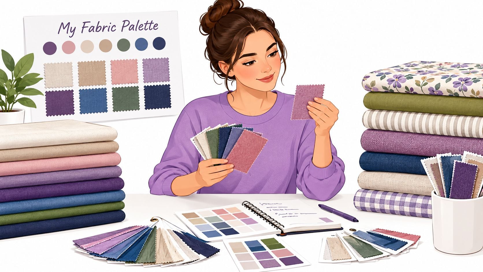
A repeatable palette process
Select the hero fabric. Choose the textile that best expresses the room's intended mood and practical needs. A performance fabric may lead a busy family room, while a more delicate textile can lead a lower-traffic formal space.
Extract two to four supporting colors. Pull colors directly from the hero rather than introducing unrelated favorites. A botanical might offer a warm cream, muted green, softened blue, and dark brown. The supporting fabrics don't need to match the print. They need to belong to its color conversation.
Separate light, medium, and dark values. Similar colors can still look flat if every textile has the same visual weight. A light drapery, medium upholstery, and darker leather or wood finish create depth without requiring strong contrast.
Reserve roughly 20–30% of the textile composition for neutrals. This guidance gives busy patterns room to breathe and keeps a coordinated collection from becoming visually noisy in this fabric-coordination workflow. Neutrals can include woven solids, quiet linens, textured bouclé, warm ivory, stone, taupe, or charcoal.
Test the bundle in context. Lay the swatches beside the intended wood species, rug, flooring, and wall color. View them in natural daylight, then take a black-and-white photograph. The photograph reveals whether the values are sufficiently separated or whether every pattern collapses into one indistinct middle tone.
A useful swatch bundle should include more than color. It should show the expected hand, sheen, thickness, and weave. A matte linen-like textile beside a subtle ribbed fabric creates a different atmosphere from velvet beside polished leather, even when both pairings use the same palette.
For smaller textile projects or early color exercises, precut Jelly Roll project ideas can help homeowners practice arranging related colors and patterns before committing to a larger upholstered piece. The same principle applies to furniture. A palette becomes convincing when its colors repeat with enough variation to feel intentional.
Match the palette to the room's job
A formal dining room can carry a more expressive chair fabric because the seating doesn't face the same daily abrasion as a family-room sectional. A bedroom can use a quiet patterned bench or accent chair, while a living room may need performance fabric on the primary seating and a more decorative textile on a low-use side chair.
The guide to upholstery materials helps frame those choices around construction, feel, and use. The palette should serve the room's behavior, not merely its photograph.
Balancing Pattern Scale and Texture
Color coordination is only the beginning. Two fabrics can share a palette and still clash because their patterns have the same scale, their textures carry equal visual weight, or their surfaces reflect light in competing ways. A polished room usually needs a deliberate relationship between large, medium, and quiet elements.
Consider a living room with a large-scale drapery print. That print already occupies considerable visual territory, especially across broad windows. A medium-scale geometric can work on an accent chair because it introduces rhythm without repeating the drapery's footprint. The sofa should then ground the arrangement with a solid, heavily textured bouclé or linen-blend upholstery that reads as a surface rather than another graphic statement.
Three scale roles create order
- Large scale establishes presence. Use it on drapery, a feature chair, or another area where the pattern can be appreciated without being interrupted.
- Medium scale connects the room. A restrained geometric, stripe, or small botanical can repeat a color from the hero fabric and create movement on occasional seating.
- Small scale or near-solid textures provide relief. Ribbing, slubbing, boucle-like loops, and subtle woven variation add interest without adding another competing image.
A room filled with large patterns can feel theatrical. A room filled with small patterns can look nervous and indistinct. The nuanced middle ground comes from assigning each textile a different job.
Texture now carries the design argument
Recent upholstery guidance describes tactile layering as a dominant direction in current fabric forecasting, with bouclé, linen-like surfaces, velvet, and other contrasting textures used to create depth in this overview of tactile fabric direction. The useful takeaway isn't to chase a trend. It's to let texture create refinement where pattern would create distraction.
A solid performance fabric with a dry, woven hand can sit beside top-grain leather on a motorized sectional. A velvet swivel chair can add controlled softness, provided the drapery and sofa remain quieter. In a dining room, a tactile seat fabric can balance a solid cherry or oak table without competing with the wood grain.
The black-and-white test deserves a permanent place in the selection process. Lay the swatches together, photograph them without color, and check whether the large pattern, medium pattern, and quiet texture still read as separate layers. If they merge, one pattern needs to be reduced or replaced.
The method for mixing patterns with balance gives homeowners a practical way to evaluate these relationships before ordering. The showroom sit-test adds another dimension. Fabric should look composed from across the room and feel inviting at arm's length.
Planning for Real-World Durability and Wear
A coordinated collection must perform long after installation day. Sunlight, repeated sitting, pet contact, children's spills, cleaning routines, and changing household habits all shape how a room ages. Choose the fabric whose care demands match the room, not just the textile that looks most luxurious in the showroom.
Top-grain leather has a substantial hand and develops character through use, yet it still needs sensible placement away from harsh direct sunlight and regular care. Performance fabric gives a high-traffic sectional a practical surface, while a more delicate textile can work well on drapery with little physical contact. A successful collection assigns durability according to function. Every surface does not need the same resistance.
Compare the role before comparing the appearance
| Fabric Family | Best Application | Durability & Aging | Ideal Coordination Pairing |
|---|---|---|---|
| Performance fabric | Family-room sofas, sectionals, and frequently used accent chairs | Designed for demanding daily use, with maintenance requirements that still depend on the specific finish and care instructions | Textured neutrals, durable woven chairs, and solid hardwood tables |
| Top-grain leather | Sofas, recliners, and statement chairs | Develops a distinctive patina and should be protected from unsuitable light and heat exposure | Quiet woven drapery, wool-like textures, and patterned occasional seating |
| Performance leather | High-use seating and motion furniture | Combines a leather surface with a practical approach to regular household use | Refined solids, textured fabrics, and restrained geometric accents |
| Velvet | Accent chairs, low-use sofas, and formal rooms | Offers depth and softness, but its pile and finish call for careful placement and maintenance | Matte linen-like fabrics, smooth leather, and understated drapery |
| Linen-like woven fabric | Drapery, occasional seating, and relaxed upholstery | Brings natural texture and may show use more readily than a performance-oriented textile | Leather, bouclé, solid cotton-like weaves, and warm wood |
| Silk-blend or delicate decorative fabric | Low-traffic drapery and ornamental applications | Best reserved for areas where handling, spills, and abrasion are limited | Durable upholstery in a related color family |
A practical arrangement might place a durable textile on a frequently used sectional, top-grain or performance leather on a nearby swivel chair, and a delicate silk-blend at the window. The collection still feels unified because color and value connect the pieces. Their different applications control the maintenance burden.
Test for the life the room actually leads
Homes with pets or children need cleanable, forgiving textures on the seating used most often. Homes with strong natural light need a considered window-treatment plan and fabrics selected with fading risk in mind. Mixed-use rooms require a clear hierarchy. Give the hardest-working piece the most resilient surface, then reserve vulnerable materials for areas with less contact.
Use this furniture fabric durability guidance to assess fabric choice as part of the broader furniture investment. Ask how each textile will look, feel, and function after years of ordinary use. Coordination succeeds when beauty and service life reinforce each other.
Expanding Your Collection Across Multiple Rooms
A whole home rarely arrives at once. A dining set may come first, followed by a living-room sectional, then bedroom seating acquired after the renovation settles. The challenge is keeping those purchases related without making every room look decorated from the same page.
The solution is a master home palette, not a single repeated fabric. The palette should establish a family of neutrals, supporting colors, wood tones, and tactile qualities that can move from room to room while allowing each space to retain its own character.
Give each room a distinct role
A dining room might introduce a deeper color through upholstered chairs, while the living room carries that same color in a smaller accent pattern. A bedroom can use the quietest version of the palette on an upholstered bench or occasional chair. The colors repeat, but the proportions change.
North American craftsmanship provides useful flexibility for this approach. Canadel dining pieces are handcrafted in Quebec, Canada. Smith Brothers of Berne is made in Indiana, USA, and Mavin is Amish-made in Ohio, USA. These lines can support different rooms while maintaining a considered relationship between upholstery, finish, and function.
For homeowners seeking Solid wood furniture Ohio, the framework should remain centered on solid cherry, oak, maple, or walnut. An Amish-made dining set can anchor the dining room with strong grain and substantial presence, while a Mavin bedroom collection can carry a related finish or undertone without repeating the dining design. The furniture acts as the structural constant, while textiles provide room-specific variation.
Plan purchases that can arrive later
Before ordering a new piece, keep a small record of the home palette:
- Core neutrals: Warm ivory, stone, taupe, charcoal, or another restrained base.
- Accent colors: The two to four supporting colors extracted from the principal fabrics.
- Wood direction: Solid cherry, oak, maple, or walnut, with the finish noted clearly.
- Texture language: Dry woven fabrics, soft pile, visible slub, smooth leather, or another recurring tactile quality.
- Pattern limits: The largest pattern already in use and the scales that remain available.
This record prevents a later purchase from introducing an unrelated undertone or excessive visual weight. It also helps shoppers compare a dining chair with an existing sofa, or a bedroom accent chair with the drapery in an adjacent hallway.
Cross-category coordination should never mean uniformity. A Canadel dining collection can sit comfortably beside a living room with a Smith Brothers leather sectional when the palette shares a grounding neutral and one repeated accent color. Mavin bedroom furniture can then echo the home's wood direction while using a quieter fabric expression.
That is how a residence grows season by season without becoming a collection of disconnected rooms. Each new purchase answers to the master palette, but none has to duplicate what came before.
Bringing Your Vision to Life in the Design Studio
A digital mood board can organize ideas, but it can't show how a textile feels against the hand, how leather changes beside solid walnut, or whether a chair remains comfortable after a proper sit-test. Those decisions belong in a design setting where samples, furniture frames, lighting, and proportions can be considered together.
The In-Store Design Studio at the Easton Town Center showroom gives Columbus-area homeowners a place to work through those decisions with complimentary design consultations. The process should begin with the room's measurements, intended use, existing finishes, and any pieces that must remain. A designer can then narrow the palette before the homeowner becomes distracted by individual fabrics.

Use customization to test the whole composition
The Custom Order Program supports fabrics, finishes, dimensions, and related materials for brands such as Smith Brothers, Canadel, and Mavin. Interactive 3D visualizers can show a selected combination in real time, allowing shoppers to change upholstery, finishes, dimensions, cushions, legs, or other details before production as described in this overview of furniture configurators.
That matters when a homeowner is considering a Mavin bedroom set or a Smith Brothers leather sectional. The visualizer can reveal whether the chosen fabric is too pale against the floor, whether a wood finish warms the room sufficiently, or whether a sectional's scale overwhelms the pattern intended for an accent chair.
For technical color matching, the industry commonly uses lab-dip approval under controlled lighting. A lab produces sample dyeings against a target shade, then evaluators compare the results in a light booth under D65 daylight and often TL84 or incandescent sources to identify metamerism. A spectrophotometer quantifies color difference as Delta E, with many buyers targeting about Delta E 1.0 as a tolerance benchmark in this explanation of fabric color matching. Those controls are most relevant to production, but they reinforce a broader showroom lesson. Color must be evaluated under more than one light source.
Finish the decision with service and value
The complimentary design consultation can help translate a swatch bundle into a practical order. Homeowners should bring paint or flooring samples, photographs taken in daylight, and a list of rooms planned for future furnishing. That information allows the palette to serve the entire home rather than only the first purchase.
A separate decor imaging guide can offer additional ideas for visualizing a room before decisions are final. Digital images are useful for composition, but they shouldn't replace the tactile inspection of upholstery, leather, solid hardwood, cushion firmness, swivel movement, rocker or glider motion, and motorized reclining features.
The showroom also provides a Low Price Guarantee with a 110% refund of the difference when a lower price is found at a local authorized dealer within the stated conditions. For immediate value, the Clearance Gallery offers savings of up to 70% on selected floor samples, overstocks, and seasonal closeouts. Those options can help an investment homeowner direct more of the budget toward the fabrics and construction that matter most.
White-Glove Delivery completes the process with room-of-choice placement, professional assembly or light installation, packaging removal, and a final inspection or customer walkthrough as defined in this white-glove delivery guide. The transition from coordinated swatches to a finished room should feel controlled, not improvised.
Visit Vinson Fine Furniture in Easton Town Center for a sit-test of solid hardwood dining, bedroom, and living-room furniture, then bring the home's fabric palette into a complimentary design consultation. The Custom Order Program, 3D visualizers, Low Price Guarantee, Clearance Gallery, and White-Glove Delivery make it possible to coordinate durable textiles and heirloom-quality pieces with confidence.